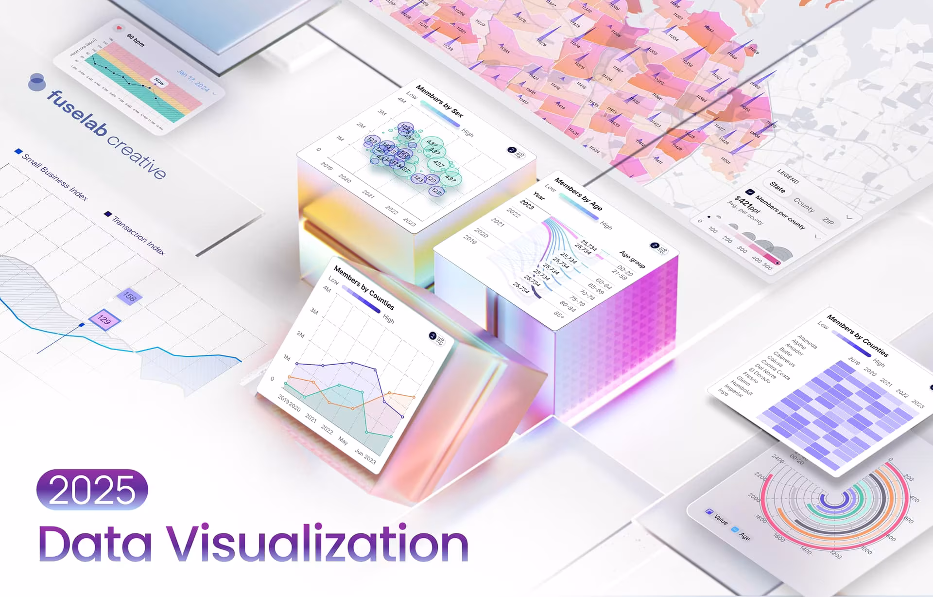
Data Visualization Trends for 2025 That Will Shape Business Decisions
Once considered a haven for only expert analysts and scientists, data visualization has now evolved into a powerful asset for businesses across industries. Why? Because of its potential to transform raw data into compelling narratives. From the simplest charts and graphs to the most interactive dashboards and immersive experiences, data visualization has come a long way.
While data visualization was primarily used to explore and understand data in the past, it has become a tool businesses cannot do without today. Data visualization trends show its increasing importance for communicating insights, making decisions, and driving innovation. As we enter 2025, this potent tool will become even more significant in shaping the business world.
Why? Consider this: data around us is becoming increasingly complex, with so much to extract, assess, and deliver. Data-driven insights have thus become the backbone of every successful business, making data visualization more crucial than ever. From uncovering hidden insights to
The increasing complexity of data and the growing demand for data-driven insights have made data visualization more crucial than ever. In 2025, we can expect an advanced era characterized by the latest trends in data visualization and exciting new possibilities.
Trends in Data Visualization Guiding Business Decision-Making
No matter how often you hear it, it is always true – ours is a data-driven world, with data taking center stage in every aspect of work and life. Effective data visualization is, therefore, indispensable – especially for businesses.
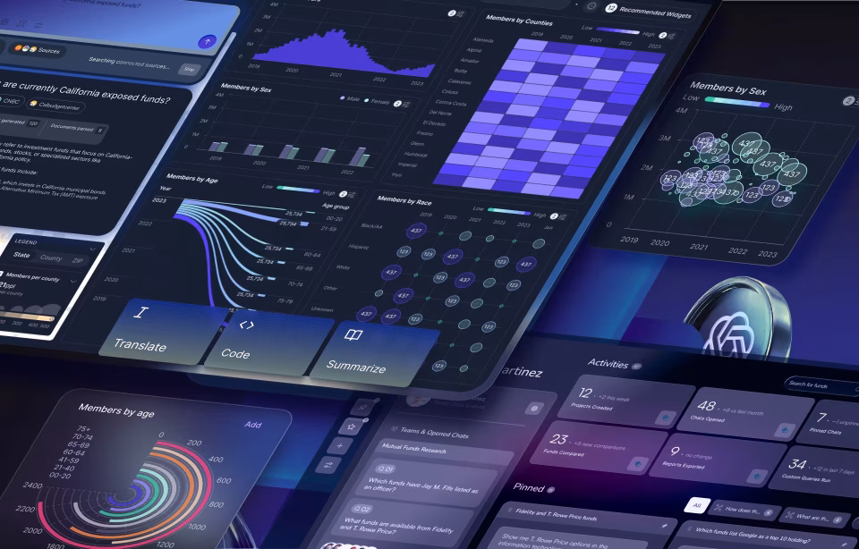
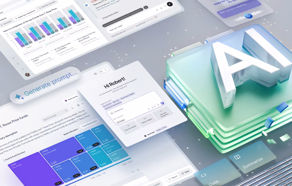
By converting complex data into easy-to-understand visual representations, businesses have a tool that helps them uncover valuable insights, make informed decisions, and gain a competitive edge. Data visualization will continue to do all this in 2025 while pushing the boundaries of innovation with some exciting data visualization future trends.
#1AI-Powered Data Storytelling
Artificial Intelligence could very much be the buzzword for the century – there is no field, no niche, and even no business that cannot turn away from using AI in the future. The same goes for the field of data visualization.
In 2025, we can expect to see AI automate the creation of stunning visualizations from raw data. AI algorithms will analyze large datasets, identify patterns, and generate visually appealing charts, graphs, and infographics. This automation will save time and effort while leading to more sophisticated and insightful visualizations. AI could generate creative visualizations, such as data art and data poetry, taking interactive insights to the next level.
AI-powered data visualization tools could also tailor visualizations to individual user preferences and needs. Since AI can analyze user behavior, demographics, and cognitive styles seamlessly, it can customize visualizations based on the user’s level of expertise or highlight the most relevant information for them, while also offering any number of variations in case the user prefers a different style of visual. This personalized approach will take user experience and decision-making several notches higher, saving us time, money, and the anxiety we have all felt when making uninformed decisions.
#2 Immersive Data Experiences
Much like other fields, virtual and augmented reality (VR/AR) technologies have much to offer in making data visualization more immersive. Using VR and AR, users can interact with data in new ways altogether. Let’s see how.
For one, VR visualizations can transport users into virtual worlds to explore datasets from different perspectives. AR visualizations, on the other hand, can overlay data onto the real world for context and insights. Such immersive experiences improve understanding, memory retention, and decision-making.
Next, 3D and interactive data visualization services can bring data to life by adding depth and interactivity to charts and graphs. Imagine being able to rotate, zoom, and pan 3D visualizations to explore data from different angles – exciting, isn’t it? Interactive visualizations allow the user to drill down into data, filter data, and uncover hidden insights. These dynamic and engaging visualizations make data more accessible and understandable, especially for complex datasets, making for a most engaging data visualization trend.
#3 Ethical Data Visualization
As data visualization grows in influence and application, it becomes even more important to assess its ethical aspects. For instance, addressing potential biases and ensuring fairness in data representations is a must.
But why?
For one, biased data can lead to misleading conclusions and discriminatory outcomes. Being aware of potential biases in data collection, analysis, and visualization is, therefore, a must to mitigate them. The key lies in using diverse datasets, transparent methodologies, and critical thinking.
Besides, transparency and accountability are two essentials when building trust. Data sources, methodologies used, and any limitations or uncertainties must be disclosed to make the process even more streamlined. The accountability lies with data visualization professionals to make sure they follow ethical principles when working around such data. Read more about how data is changing the world.
#4 Data Visualization for the Internet of Things (IoT)
Another powerful technology that can be used in conjunction with data visualization is the Internet of Things (IoT). Think of it this way – what IoT basically does is generate real-time data (lots of it) from various connected devices. But how we do make sense of this huge chunk of data?
This is where data visualization steps in.
Emerging trends in data visualization point to its inter-dependence on IoT technology. Real-time data visualization tools can monitor and analyze data streams as generated, so decision-making and problem-solving are both timely and effective.
Interactive dashboards, live maps, and real-time charts are some techniques that make this possible.
Another interesting integration is with predictive analytics to analyze historical data, identify patterns, and forecast future trends. Data visualization is paramount here to understand and communicate these predictions.
Imagine being able to visualize predicted outcomes for your startup – you could easily grasp the potential implications of different scenarios, optimize supply chain operations, forecast energy consumption, predict customer behavior, and so much more. The Robodog AGV project, for instance, uses real-time insights and powerful analytics to optimize workflows, reduce downtime, and drive productivity.
#5 Data Visualization for Climate Change
One up-and-coming trend that’s here to stay revolves around environment-centric practices. Climate change, for instance, is a complex challenge with global stakeholders, cross-connected factors, and ever-changing dynamics. Data is again at the center of the crisis, and data-driven solutions are the only way forward.
Understanding the critical state of our climate is a prime candidate for the utilization of the latest data visualization trends. Making use of data in this way can help people around the world understand and communicate the impacts of climate change. For instance, visualizing complex climate models, temperature trends, and sea-level rise projections can help extract patterns, assess risks, and inform policy decisions. Researchers, policymakers, and even the public can use data visualization tools to grasp the scale and urgency of climate change.
Another aspect is effective communication and data visualization in enabling it for a broad audience. Clear and concise visualizations could turn out to be powerful tools for making climate data more accessible and understandable. For example, interactive maps, charts, and infographics can help people visualize the impacts of climate change on their local communities. The public can be better engaged with compelling data visualizations, fostering a deeper understanding of climate science and inspiring action.
#6 Data Visualization for Social Impact
Data visualization can also drive social change better than we know. With social and economic data visualized, it becomes easier to identify disparities, inequalities, and areas of need. Such data-driven insights can inform policy decisions, mobilize resources, and empower communities.
For example, visualizing poverty rates, healthcare access, and education outcomes can help policymakers target interventions and allocate resources effectively. Data visualization health trends have, in fact, never seen quicker and wider adoption than the COVID-19 pandemic, when entire response rooms assumed the shape of data centers, relying on interactive maps, dynamic dashboards, and easy-to-grasp insights.
Another exciting take is the confluence of data journalism and storytelling. Journalists use data-driven narratives to uncover hidden truths, expose social injustices, and hold power to account. Just check out any data-rich New York Times article and you will see data visualizations for miles. Powerful data visualization can illustrate key points, highlight trends, and provide context for complex issues. Journalists can thus raise awareness, spark conversations, and drive social change.
#7 Low-Code and No-Code Data Visualization Tools
Low-code and no-code data visualization tools are other interesting practices making their way into 2025. One of the biggest reasons these tools are gaining popularity is because they make it possible for even the non-technical user to analyze data and create powerful visualizations.
How do they make this possible?
For one, these tools have a friendly UX/UI design so users can drag and drop data sources, select visualizations, and customize how their charts and graphs will look. A wider range of users can thus leverage the power of immersive data visualization trends.
Another point is that low-code and no-code tools significantly improve the data visualization process. Users can quickly prototype and iterate on visualizations, explore different data perspectives, and refine their insights. This rapid prototyping capability makes it possible for businesses to make data-driven decisions faster and more efficiently.
Besides, the user gets to experiment with different visualizations on the go. This creates more room for creativity and innovation.
Also read about Qgen Health Lab – an intuitive interface with the future of cancer treatment in mind.
#8 Micro Animations in Data Visualization
With user experience taking center stage across industries and products, micro animations are set to be another raging trend this year. These features can make products more intuitive and user journeys more interactive.
Small and subtle micro animations typically feature in the form of data point highlights, animated transitions, and progress indicators. For instance, a subtle animation like a gentle pulse or slight enlargement when hovering over a data point on a chart can make it stand out. Users can easily identify and focus on specific data points of interest.
Smooth transitions between different views or filters within a dashboard could make the experience more engaging and fluid. For example, animating data filters or new data points on the screen can add to the dashboard’s appeal.
Designers can also add subtle animations to indicate loading states or the progress of data queries. While this has nothing to do with the technical analysis or representation of data, it can provide visual cues to the user, reduce perceived wait times, and improve the overall user experience.
Future Trends in Data Visualization
While these were the top 7 data visualization trends for 2025, let us not forget that technology is advancing at a more rapid pace than ever before. This means all aspects of technology, including data visualization, could evolve in exciting new directions with time. Some developments on the futuristic side could soon step in are shape the field in the times to come.
Emerging Trends in Data Visualization
With so many new technologies and integrations on the horizon, have you ever wondered how could a business use data visualization to identify new trends in the future? Will new technologies be stepping in to change the game? Will data visualization blend in with some of the more advanced technologies to elevate the decision-making process? Let’s find out.
Neuro-inspired Visualization
While data visualization is becoming more advanced and complex, it is also set to become more easy-to-consume with neuro-inspired visualization. This principle relies on the intricacies of human cognition to design visualizations that are more intuitive and effective.
Simply put, neuro-inspired visualization techniques leverage our brain’s natural ability to process visual information in color, shape, and spatial relationships. Visualizations are aligned with these cognitive principles to create more engaging and memorable experiences. Think adaptive color schemes as highlighted in data visualization trends.
For instance, using colors to represent different categories of data helps our brain quickly identify patterns. Similarly, organizing data into hierarchical structures can mimic how the brain processes information. This makes it easier to understand complex relationships. Data visualizations will incorporate such neuro-inspired techniques in the future so they are both visually appealing and cognitively efficient.
Quantum Visualization
With its ability to process vast amounts of data exponentially faster than classical computers, quantum computing opens up new possibilities for data visualization in the future. Quantum visualization could make it possible to explore high-dimensional datasets currently beyond our computational capabilities. We could uncover hidden patterns and insights previously thought to be impossible.
For instance, quantum visualization could allow us to visualize the complex interactions between countless variables – the intricate relationships between genes in a biological system or the dynamic patterns of global climate change. This has the potential for multiple breakthroughs in fields like medicine, materials science, and climate modeling, to name a few.
Biometric Data Visualization
Biometric data visualization visually represents physiological data like heart rate, brain activity, and eye movement. Analysis of these critical data patterns could uncover new insights into human behavior, emotions, and cognitive processes.
For instance, visualizing heart rate variability could reveal stress levels. Tracking eye movements could indicate attention and engagement. The emerging field of biometric data visualization holds endless possibilities for healthcare, psychology, and human-computer interaction. Read more about how data visualization is changing healthcare for the better.
Data Visualization for the Metaverse
From gaming to art to travel, the metaverse is gaining quick traction globally. Its experience could be made even more immersive and informative with simulation data visualizations soon.
For instance, geographic data could be visualized in 3D virtual environments, making it possible to explore cities, countries, and even planets in unprecedented detail. This can be particularly useful for urban planning, environmental monitoring, and historical research.
Another interesting application lies in interactive data sculptures. A data sculpture could represent anything – global temperature data, for instance, with different colors and textures representing different temperature ranges. Users could interact with the sculpture to zoom in on specific regions, analyze historical trends, and predict future climate scenarios. Plus, doesn’t this sound fun or what?
Similarly, real-time data visualization – stock market data or social media trends, for example – could be generated in virtual environments. This would make the experience of using such data more immersive, engaging, and informative. Traders, analysts, and researchers could have a completely new and redefined way of working with such important data day in and day out.
Also read about Aircraft Bluebook – a premier resource for general aviation aircraft values with dependable aircraft valuation data.
Conclusion
The world is embracing emerging technologies and innovative techniques in every field, and the same can be said for all of the data visualization trends we have discussed. Future data visualization trends lie in unlocking data’s full potential to drive insights, inform decisions, inspire action, and quite possibly to entertain.
Data visualization is evolving faster than ever before, making it all the more important to prioritize the human element and create visualizations that are informative, engaging, and inspiring. The time is ripe to combine creativity, technology, and human insight to shape the future of data visualization.
If you are looking to leverage the power of data visualization for your business, all you need is an expert partner like Fuselab to bring your insights to life. With our dashboard development and digital product development services, you can drive business decision-making with insights that are immediately actionable for staff from every level. Reach out to our experienced team and let us help you design a product that meets your goals.