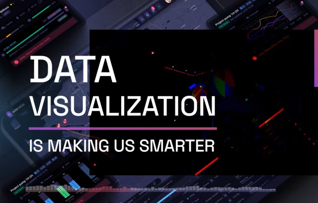
Good visualizations tell a story without the need for formal explanations. It is a nexus point where design, science, and communication exist to inform people in the language of the future.
Data Visualization Agency
As one of the best design agencies in the USA, we now have over a decade of experience creating data heavy presentations, applications, and digital tools. To remain competitive, any organization that seeks to influence the thinking, actions, and engagement of their users must employ a team of designers to present their data in a meaningful and intuitive fashion. This is now how successful businesses learn and make better decisions in the future.

Contact Us
Fill out the form!
Keys to running a successful Data Visualization Agency
A successful agency in this space must maintain a mastery of both fundamental design principles and cutting-edge technologies. This requires us to create an environment that supports and encourages a constant state of learning and adaptation as visualization tools, programming languages, and design trends evolve. We also cultivate expertise across multiple platforms (like Tableau, Power BI, D3.js, Python) while developing our own custom approaches that set Fuselab apart from our competition. Technical excellence means not just implementing client requests, but proactively proposing innovative solutions that reveal insights clients might not have discovered independently.
Beyond simply executing client requests or project requirements, agencies like ours work diligently to establish genuine partnerships through a deep understanding of client objectives, audience, and business context. This is how we get so many returns or renewals from our existing clients. This requires developing frameworks for thorough discovery processes that uncover unstated needs and identify how our approach will be used in decision-making. We think of ourselves as strategic advisors who translate business questions into visual solutions, helping our clients refine what they’re trying to learn from their data rather than just delivering what was initially requested. This is a huge differentiator for us.
Data visualization is fundamentally about finding the perfect design to communicate something, which makes our storytelling abilities crucial for our continued success. This means transforming complex information into compelling narratives that resonate with specific audiences. Successful agencies employ team members who understand both data structures and human psychology, combining analytical and creative thinking. They recognize that even technically perfect work will fail if it doesn’t effectively communicate insights in ways that not only make sense but also inspire action. At a minimum, we need to excel at adapting communication styles across different industries and types of target audiences.
The most effective agencies cultivate teams with diverse skills beyond just technical implementation. This includes data scientists who understand statistical validity and can help our design team rethink what’s possible with a dataset. We only hire UX designers with a fluid approach to their job. At times, they will need to focus on user interaction and become a kind of subject matter expert in our client’s industry, but they also need to work as project managers who can coordinate complex workflows. Success comes from establishing processes that leverage these diverse perspectives while maintaining cohesive output, often through paired work approaches that combine technical and design expertise throughout project lifecycles rather than handling these as separate phases.
After many years in this space, we have built an exceptionally distinct portfolio that showcases our unique capabilities. This has required Fuselab to maintain a strategic project selection and documentation practices. Successful agencies balance client confidentiality with the need to demonstrate their expertise, while sometimes having to develop alternative versions of client work for public sharing or pursuing self-initiated projects that demonstrate capabilities without client constraints. We have also developed proprietary frameworks, reusable components, our own design system, and methodologies that opened the door to intellectual property beyond our client deliverables and greatly improved our agency-wide efficiency.
Data Visualization
Process
As a data visualization company our process for developing highly intuitive data visualizations as a service follows a distinct and sequential flow that helps us ton consistently deliver the impactful work that communicates incredibly intricate subject matter with ease and simplicity. Creating data visualization solutions is typically implemented within a custom dashboard such as our the current product we are hoping to launch soon, and is currently in the beta testing stage: Fusedash.ai.

Discovery
– What kind of data is there?
– What does the data show?
– What can we do with the data?
– What is the value in the data?
– Who is the target audience(s)?

Data Manipulation
– User Research
– Personas
– User Behaviors
– Competitor Analysis
– Data Analysis

Design Formats/Apps
– PowerBI vs. Tableau
– Custom Python
– Traditional graphic design
– JavaScript/Animations

Visuals
– Bubble Cloud
– Heat Map
– Histograms
– Scatter Plot (2D or 3D)
– Sankey Chart
– Infographics

Testing
– Customization
– Comparison Analysis
– Modeling Options
– Finding Outliers
– A/B Testing
– Heuristic Testing

Data Tells a Story
– Create data sequencing
– Develop report generator
– Create ability for KPI tracking
– Allow for user customization
Research
and Analysis
Heatmapping as a starting point
Often times users want to study the demographic data of a particular region in the world, and they want to compare this data other vicinities around it or in various other areas of the world. This can be true for countries on a world map, states on a country map, or even neighborhoods. As a result, heat-mapping is often a great place to start to set the stage for deeper dives into particular regions and demographics.

Taking data to
the next level
The ultimate stage receiving insights around data takes place within an interactive dashboard. Unlike so many graphics we see on the web or in periodicals, the dashboard allows for user customization, data-driven insights, and ability to incorporate relational data within a functional tool that paves the way for continuous knowledge transfer through real-time data updates.

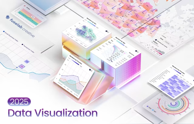
Data Visualization Design Agency Portfolio


Data Visualization Examples

Data Visualization UI UX Design
UI UX design for a data visualization products is huge part of what we do every day now. Our approach to these services begins with agreeing to a simple set of project and business goals, which sets the tone for the entire project, and allows us to build products that gain the trust of users in minutes.

Data Visualization Dashboard Design
Creating these dashboards is how we have become one of the top data visualization agencies in the USA. This is particularly true of our work with healthcare application development, which serves up patient data for medical providers to help deliver better health outcomes, and a more efficient care environment.

Business Data
Visualization
Business intelligence has become a critical service for the most successful businesses, both big and small. Whether you are looking to better understand your business analytics or you are launching a new digital product, you will need a data visualization company to help you deploy data analytics services to understand the ebb and flow of your market and to gain the required knowledge needed to stay competitive.

Custom Data
Visualization
Producing custom data visualization solutions in the world of big data is not as elaborate as it sounds, it’s really about creating filtering and tabular functional options that are able to manipulate data in real-time to help organizations make better and more informed decisions and planning-based predictive analytics. If you can provide this, you are already way ahead of a lot of your competition.

Related Services and Solutions
Data Visualization The Tools
& Technologies We Use
If you aren’t curious about how the impact of new technologies and strategies are changing our world of design and development then you might as well throw in the towel now. The tech we use here is in a constant state of change as we better understand the assets and limitations of what we are using and what is now available.
Tableau
Three.js
Chartkick
Recharts
Vue.js
ApexCharts
D3.js
V Charts
Power BI
React-Vis
WebDataRocks
FlexMonster
Industries We Create
Data Visualizations For

In many ways how patient data is used and displayed has transformed healthcare for the better by enabling medical professionals to track patient outcomes, identify treatment patterns, and detect disease outbreaks through interactive dashboards that convert complex clinical data into actionable insights in seconds. These visual tools help physicians make more accurate diagnoses, researchers identify correlations in medical studies, and administrators optimize hospital operations.

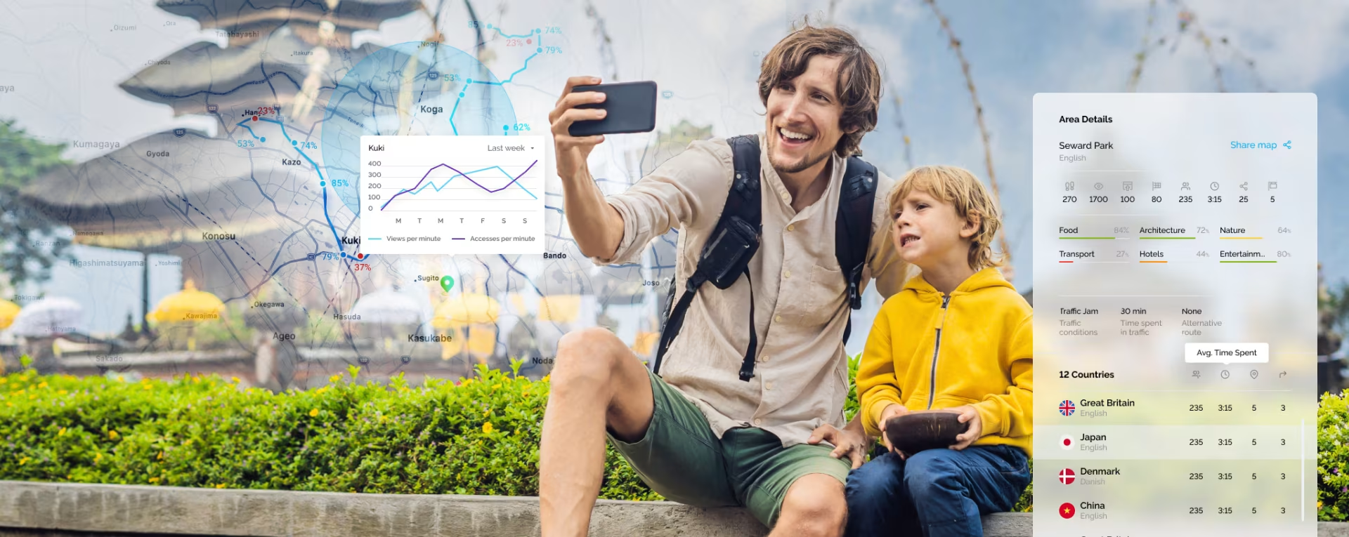
Our travel industry clients leverage data viz to analyze customer preferences, optimize pricing strategies in real-time, and identify emerging destination trends through heat maps, interactive graphs, and geospatial displays. Airlines use analytics to improve route planning and occupancy rates, while hotels employ interactive dashboards to track booking patterns and customer satisfaction, enabling personalized experiences.

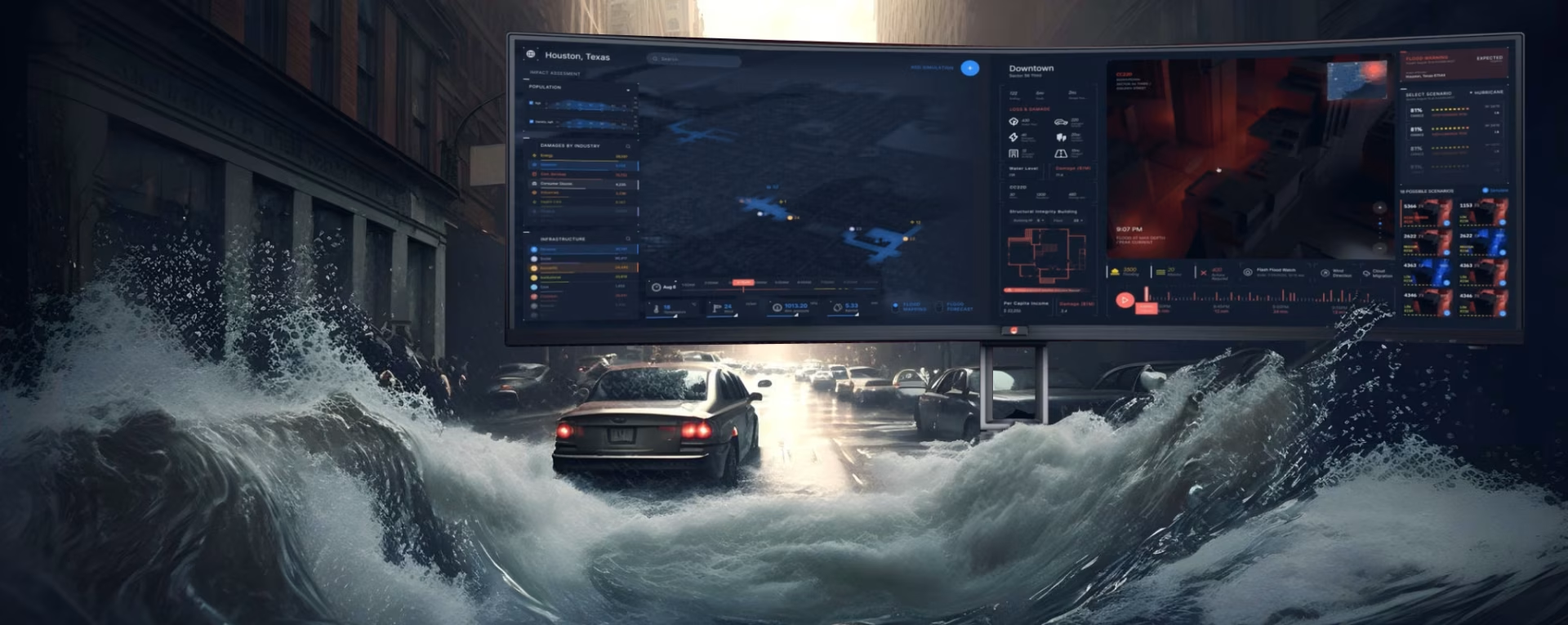
Client’s of ours like Automatize, use our custom dashboard designs to displaying traffic patterns, vehicle movements, and infrastructure usage through color-coded maps and real-time dashboards that have become a game changer for the logistics fleet manager. Transportation authorities use these tools to reduce congestion, optimize public transit routes, and plan infrastructure investments.

In real estate, data design has transformed property valuations, market analysis, and investment decisions through interactive maps showing neighborhood demographics, property values, and development trends. Agents use visual tools to help clients understand market conditions, developers analyze population growth and zoning changes through interactive maps, and investors compare investment opportunities with visual ROI projections across different property types and locations.

Data visuals are essential in artificial intelligence and machine learning for understanding complex algorithms, interpreting model outputs, and communicating insights to non-technical stakeholders through intuitive representations. Engineers use 3D charts to debug models, detect bias in training data, and optimize neural network architectures, while business leaders rely on dashboards to monitor AI system performance and understand the impact of machine learning solutions on business outcomes.

E-commerce businesses thrive through the use of tools that show detailed customer journeys, purchasing behaviors, and inventory management metrics through interactive sales funnels and real-time dashboards. These sources help identify top-performing products, optimize website design based on heat-maps of user interactions, personalize marketing campaigns through customer segmentation graphing, and forecast demand patterns to improve inventory management and reduce costs.
Read Our Blogs
Data Visualization Design Blogs